Billboard Hot 100 Challenge App
Social game app that challenges players to predict the next top music hits.

Project Overview
Republic Records seeked a creative production partner to build native iOS and Android app that gives music fans the chance to compete and prove they have “the golden ears” to predict tomorrow’s hits. For more than six decades, The Billboard Hot 100 chart has remained the music industry’s most authentic and prestigious chart for measuring hits. Together, with Billboard and Republic, we created a rewarding interactive experience for fans that’s mutually beneficial to labels and artists.
For the first time, fans over the age of 18 will compete against one another in a game of skill to win various prizes. Over the course of the contest period, fans will be asked to listen to one new song every day and predict the final peak position for that song on Billboard’s Hot 100 chart. An algorithm will determine points earned for predicting chart position with accuracy. The points will determine the grand prize winner and winners for other contests throughout the competition.
The app will provide fans with artist bios, photos, touring, and information about the singles and albums. In addition, fans will be able to stream music directly through the app. Record labels will have dashboard access to reporting that will provide valuable data, analytics, and research acquired from fans participating in the competition.
GOALS
Goal 1
2
3
CLIENT
Republic Records, Billboard
ROLE
Associate Creative Director (UX research, Interface design, Interaction design, Creative direction, Client presentations)
TOOLS
Figma, Sketch, Adobe After Effects, Zeplin
TEAM
Project Manager, Junior Designer, BE Developers, FE Developers
AGENCY
AMP Agency
🚀 Launching in 2024
EVALUATION
Focus Areas
The previous app evaluation started with four key focus areas for enhancement. While playing with the app, we used these buckets to write down ideas. This help categorize what to improve on without going too far from the original client request.


EVALUATION
Breakdown
Next, we took each focus area’s notes and combined the similar ideas into sectioned proposals. This helped us see the similar views from each player and keep the integrity of the original app.
Look & Feel
The UI of the previous app had no relationship to the current brand guidelines for Smucker’s. The target audience considered here are young children and teens. To bring those together, a full UI update would be proposed to incorporate imagery and typographic that better aligns with the brand.
UX Considerations
Updating iconography to better relate to the action taken and easier user flow from game to game.
Games
We found that two of the previous games were very similar (Conversation Starters & Trivia), so we proposed to only keep Trivia. Reason being, the trivia experience provides a better gaming aspects for points and speed. The same topics can be brought into the trivia game and discussed at the table during play.
Improvements to the existing Smash game and Trivia game to increase challenges were also proposed.
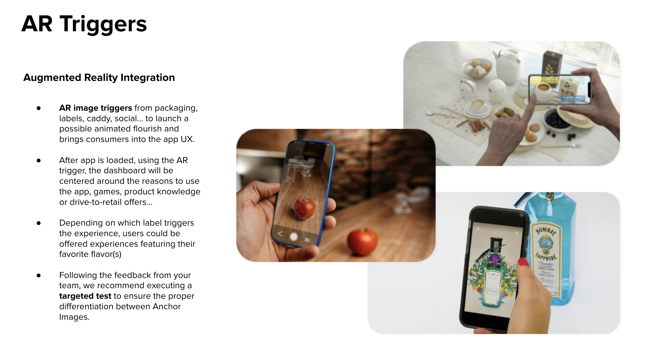
AR Triggers
The new and improved feature of the redesign is the AR packaging trigger. We would use a jelly packet label design as the trigger, which would pull the flavor and set a theme to the game experience.
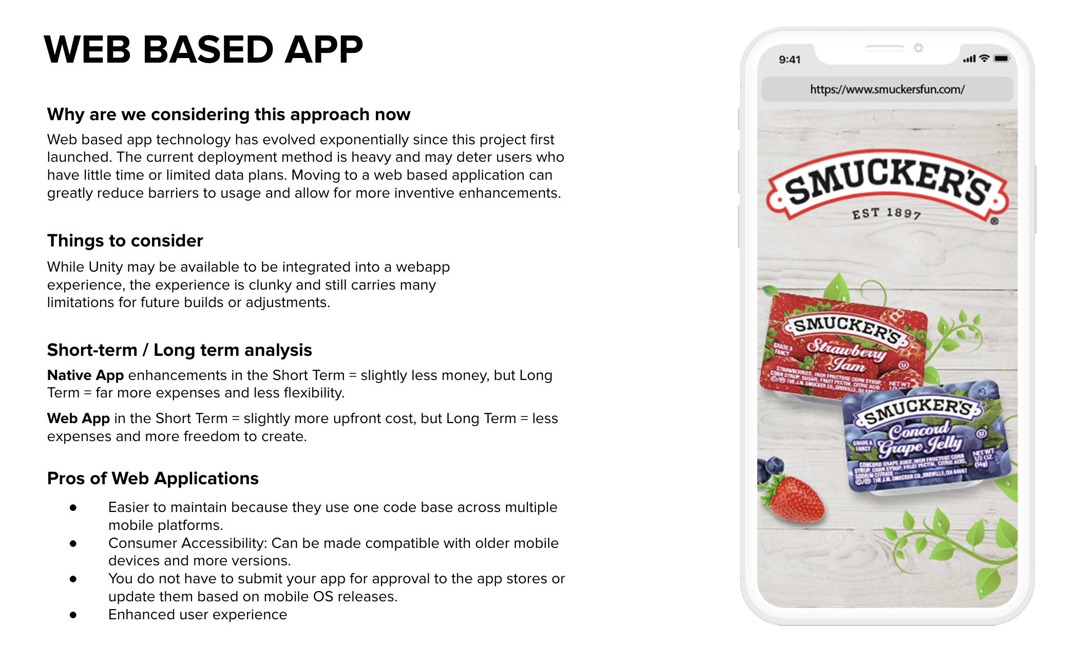
Web Based App
We found the native app approach for this project was holding back potential opportunities in development. A downloadable app can limit the amount of users available - slow network, limited data, children don’t have permissions, older model compatibility. This was a requirement we suggested to help in the longevity of expenses and freedom to expand functionality.


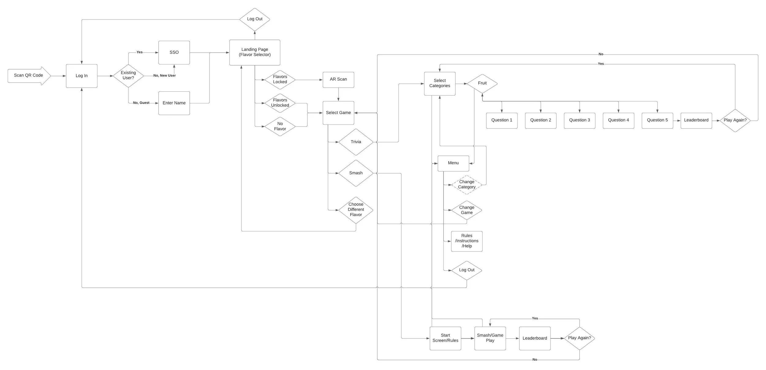
Site Map
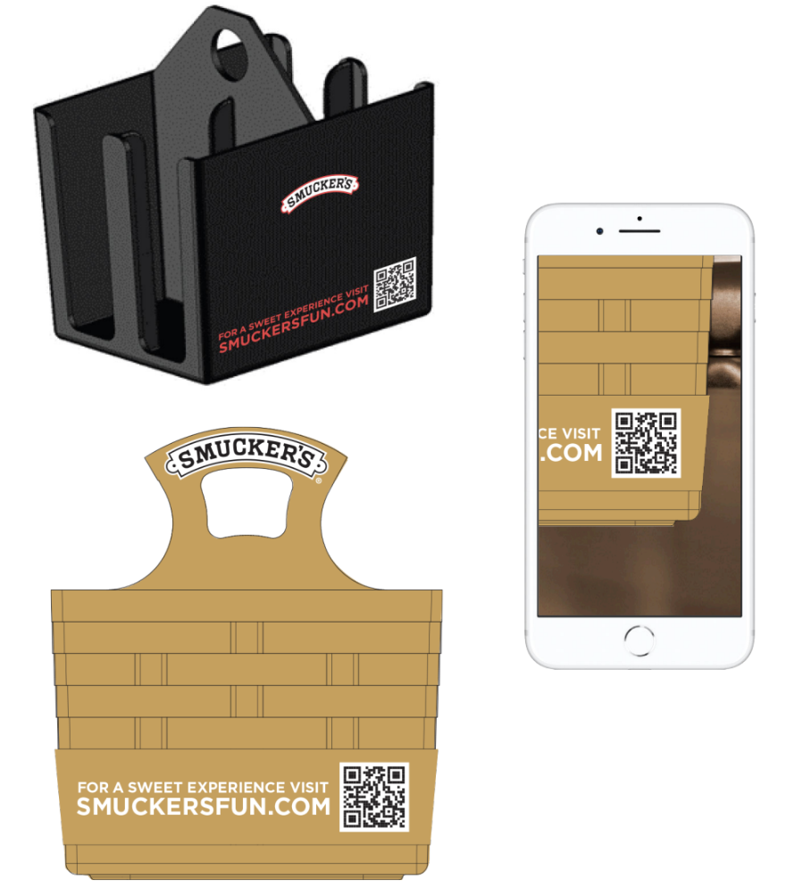
Now, with the new technical update for this project, the only way users could get into the experience is through a QR code or link. We had to highly consider their physical location, QR code placement, and Smucker’s packaging to avoid any blockers during game play.
The site map depicts the “flavor scan” that determines the theme/color of the rest of the games. If a flavor package cannot be scanned at location, maybe due to low inventory, we have a skip pathway.
This project’s site map is unique to other projects I have worked on because there are 2 games in 1 app. So the user needed a way to change their game selection at any point before or after completing each timed game.
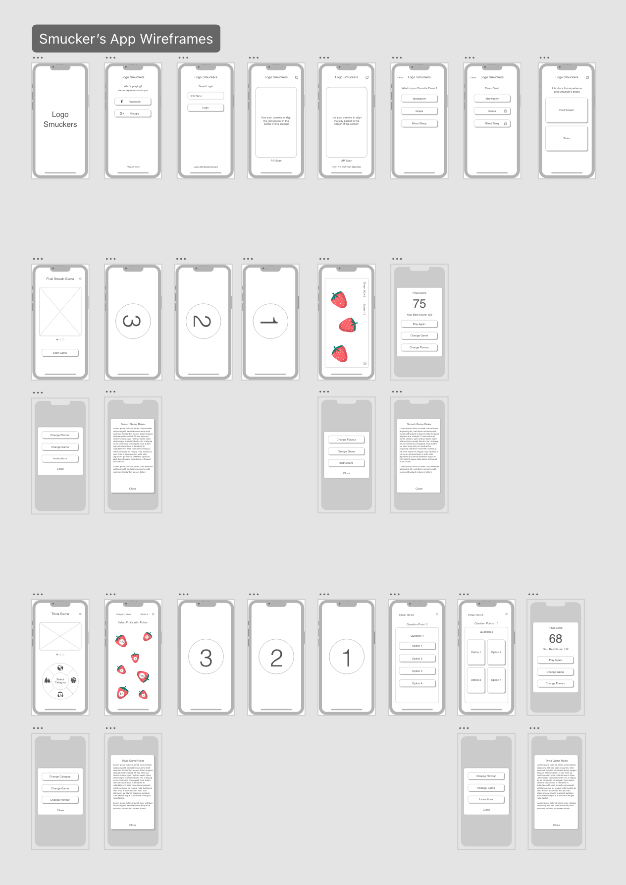
Wireframes
We split the wireframes into three sections - sign in/AR scan, smash game, and trivia game. The sign in process now offers SSO or an optional guest user. Going through each should always bring the user to the AR scan.
Our main challenge here was the use case when a jelly packet is not available. The solve was for an optional skip button to appear when a trigger point wasn’t detected for a certain amount of time. If no trigger, then a flavor picker is prompted.
Providing important information during game play such as, instructions, ending game, and changing the game was thought through during this step.


FINAL DESIGNS
Sign In
After scanning the QR code or entering via URL, the web app will launch with a sign in screen. SSO integration will allow for data collection and return user scores to be tracked.
Any future social sharing will be easy to add when players are already logged in to their accounts.
We still want to offer users to play without social sign in - as we know from our demographic, these players can be young and without a social presence. Playing as a guest offers the same game features without tracking best scores per session.


FINAL DESIGNS
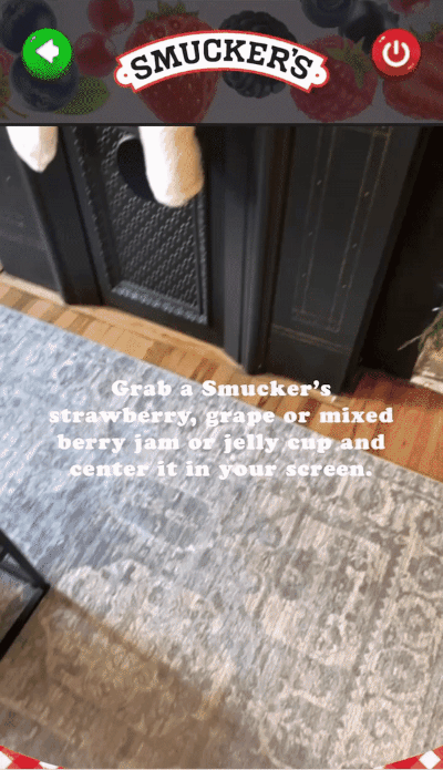
AR Jelly Packet
While working with a freelance 3D designer who specializes in game development and Blender, we were able to create three different AR designs for each of the jelly flavors. Once the packet package face is detected, the fruit appear from around the edge and move as if being held on. The user can move around the package to see the 3D fruits and bee circling around.
The packet flavor detected will enable a CTA to proceed to the games using that flavor theme. The themes are subtle color and imagery changes.
If a trigger is not detected in the camera within 5 seconds, a skip button appears so the user can proceed by picking their favorite flavor.
FINAL DESIGNS
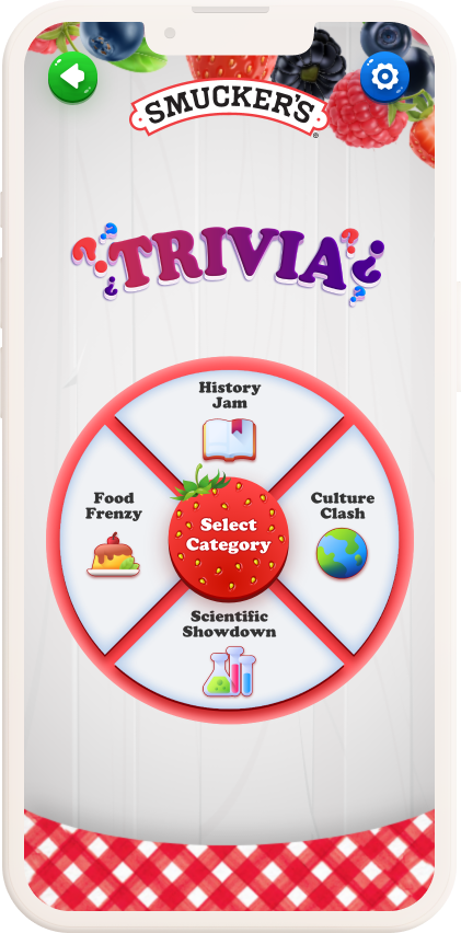
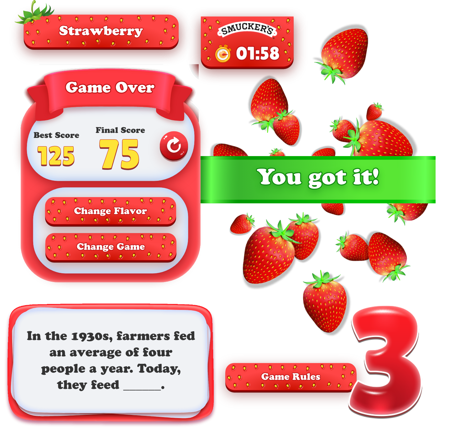
Trivia Game
The updated trivia game still contains the categories from the previous app, with an improved experience that allows the player to master each one. Previously the categories were spread across the questions. Now a player can have multiple questions under the same category. The final score can then be improved upon per category.
The following screen keeps track of the questions answered and shows their point value. As soon as a question is answered, the player goes back to the berry screen to pick the next question. When the player completes the last question, the game is over revealing the final score.
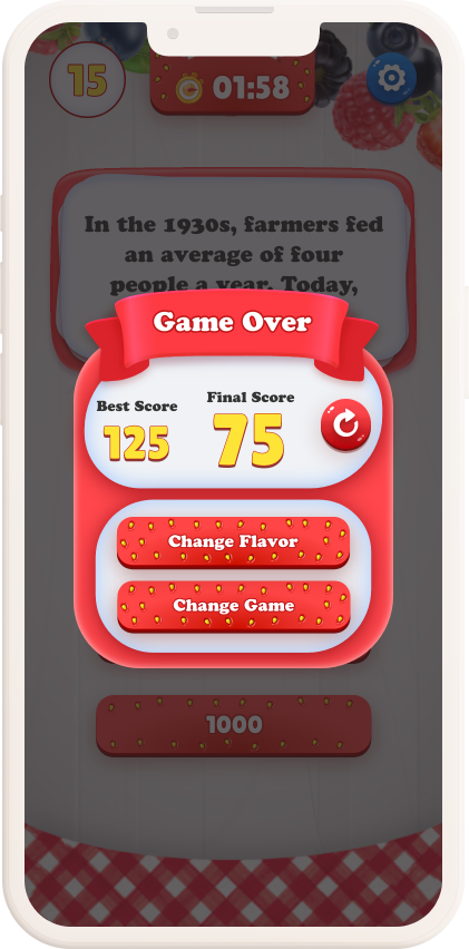
The trivia question experience improved drastically with a countdown screen so the player has time to prepare for the question. An updated timer & value UI keeps the player reminded of the question duration and points to be received. Our new UI takes into consideration the length of questions, as these can be updated anytime by the client with a headless CMS.
Once the game is over, we improved return rate by offering a best score tracker. If the user logs in via Facebook or Google, we can keep this score available anytime they return to the app. A guest will keep the score only for their session.