
Design System Audit
Bringing FedEx Mobile closer to the enterprise’s global design system by conducting an audit and providing components and documentation for native capabilities.
Project Overview
The FedEx Mobile Team engaged Tank Design to align the FedEx native app experience to their design system standards. The old experience leveraged native features between iOS and Android, forming two distinct app experiences for users.
GOALS
Provide an appropriate level of freedom within the design system and enable designers to work more efficiently
Solve for compliance issues with the enterprise brand standards and accessibility
Create a maintainable library of components to empower designers to own
Provide supporting written documentation for usage
CLIENT
FedEx Mobile
ROLE
Senior Product Designer
TOOLS
Figma
TEAM
Project Manager, Product Design Director
AGENCY
Tank Design
Focused Charters
Our team was given six starting focus areas to begin our work. These charters would return the most value to the app’s design and compliancy, tackling some foundations like typography and color.
-
Designed a new type scale using FedEx’s proprietary font providing consistency between operating systems.
-
Find ways to introduce the FedEx color palette and bring more vibrancy to the app.
-
Ensure buttons are designed for mobile users with appropriate touch targets and hierarchy.
-
Create mobile optimized form fields that lean on native capabilities.
-
Bring alignment between operating system terminology and offer guidance on when certain communications are needed throughout the customer mobile journey.
-
Explore and identify areas the app could use branded imagery and illustrations.
The Approach
Existing landscape & analysis
The audit started with a review of the app’s font and color because each charter would inherit those decisions. We received materials from two internal libraries, separated for each operating system, and used the FedEx Design System as a guide for consistency.
KEY TAKEAWAYS
Bloated typographic scale and color palette.
Unused company proprietary font, FedEx Sans, non-compliant with brand and one of the only products remaining for adoption.
30+ non-brand colors including mis-use of gradient.
Size of buttons are not passing accessibility standards.
Definition of a button was crossing over into other components with interactivity.
Relying heavily on native form controls and interactions.
Education needed to support differences in modal, non-modal, and bottom sheets in native apps.
Research & rationale
We conducted a competitive analysis to identify improvement opportunities. If they can do it, what’s stopping us?
We leveraged our learnings from the competitive analysis, in addition to our deep experience in building design systems, to bring best practices to the FedEx mobile app. Our experience and market research helped drive alignment and trust with FedEx design leadership.
Exploration
For each charter, we explored ways to define new styles, components, and opportunities. In our explorations, we integrated FedEx’s experience principals and humanized tone by providing guidance for the Mobile team to consider through our explorations.
Deliverables

Typography
TYPOGRAPHIC SCALE | DOCUMENTATION
Once the client team aligned on using FedEx Sans, we created the new typographic scale. We switched the font family into key screens as part of exploration and mapped letter spacing and line height to set values.
We created guidance for the new scale to ensure consistency and legibility. iWatch guidance included!
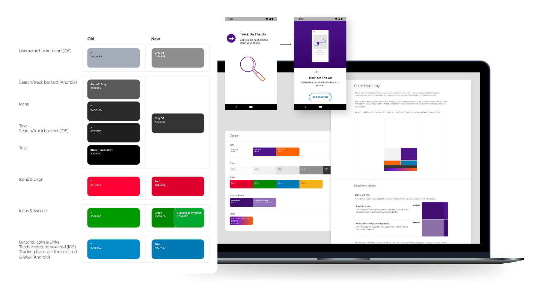
Color
ENHANCED COLOR PALETTE | COLOR OPPORTUNITIES | DOCUMENTATION
We enhanced the FedEx color palette for the native app with two additional colors to help with shadows and depth. We provided written guidance to support how to use se new colors.
The previous 13+ gray shades now mapped to the 5 FedEx gray color ramp.
Now with compliance to Brand, we explored opportunities to inject more color into the app through onboarding screens with lifestyle images and illustrations.
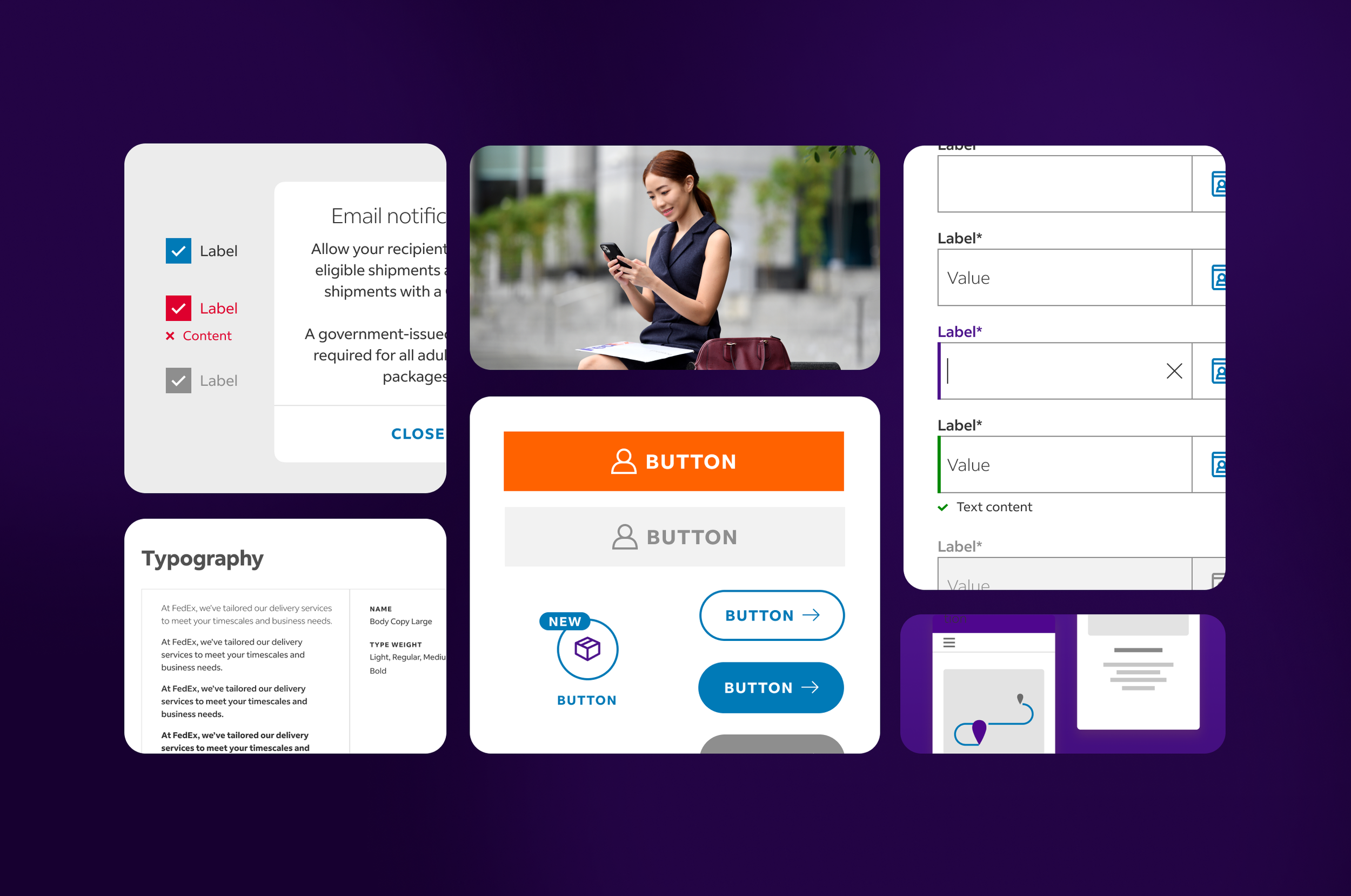
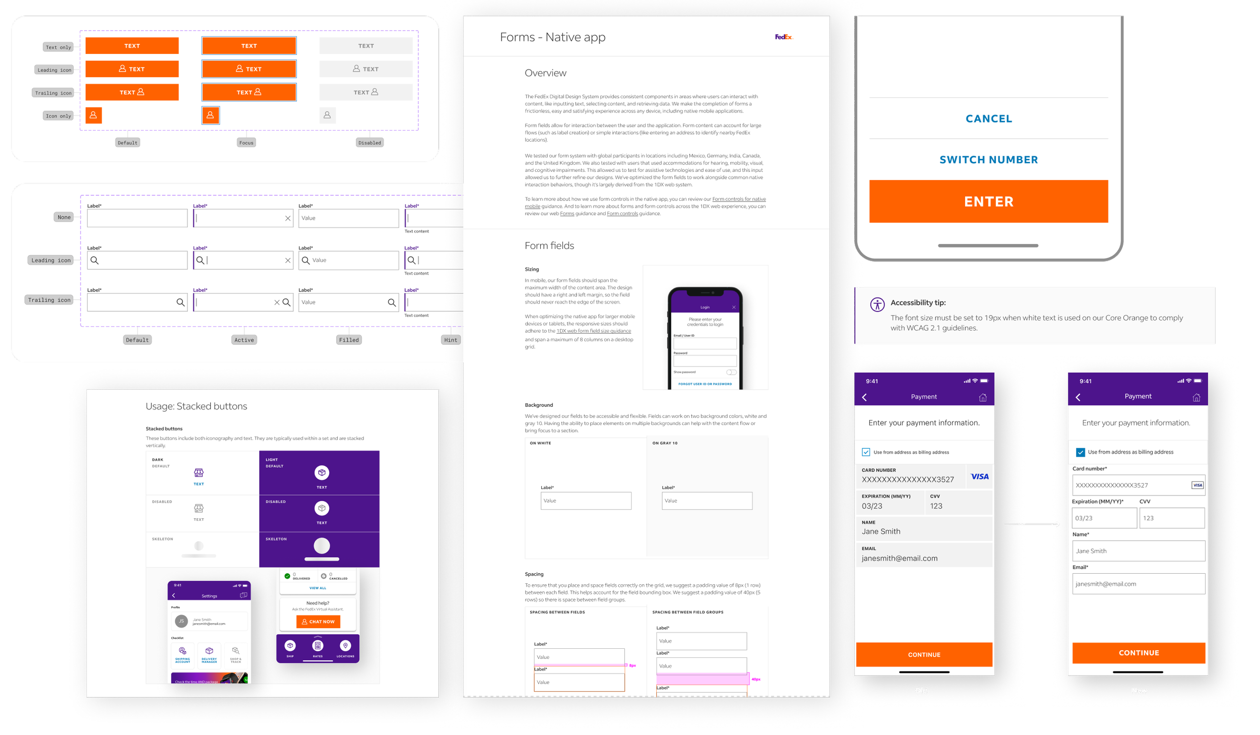
Buttons
COMPONENT LIBRARY | DOCUMENTATION
The Mobile Team needed their own button sets which included 9 types that maintained alignment to the FedEx Design System. We accommodated mobile touch zones, text accessibility, and full-width placement in addition to removing unnecessary states, like hover.
Form fields
COMPONENT LIBRARY | DOCUMENTATION
We guided the team away from using native form fields and delivered a new component set based on FedEx’s web inputs. Because the input fields would be custom, we wrote documentation to give designers and developers the ability to leverage native features, including keyboards and dropdown menus.
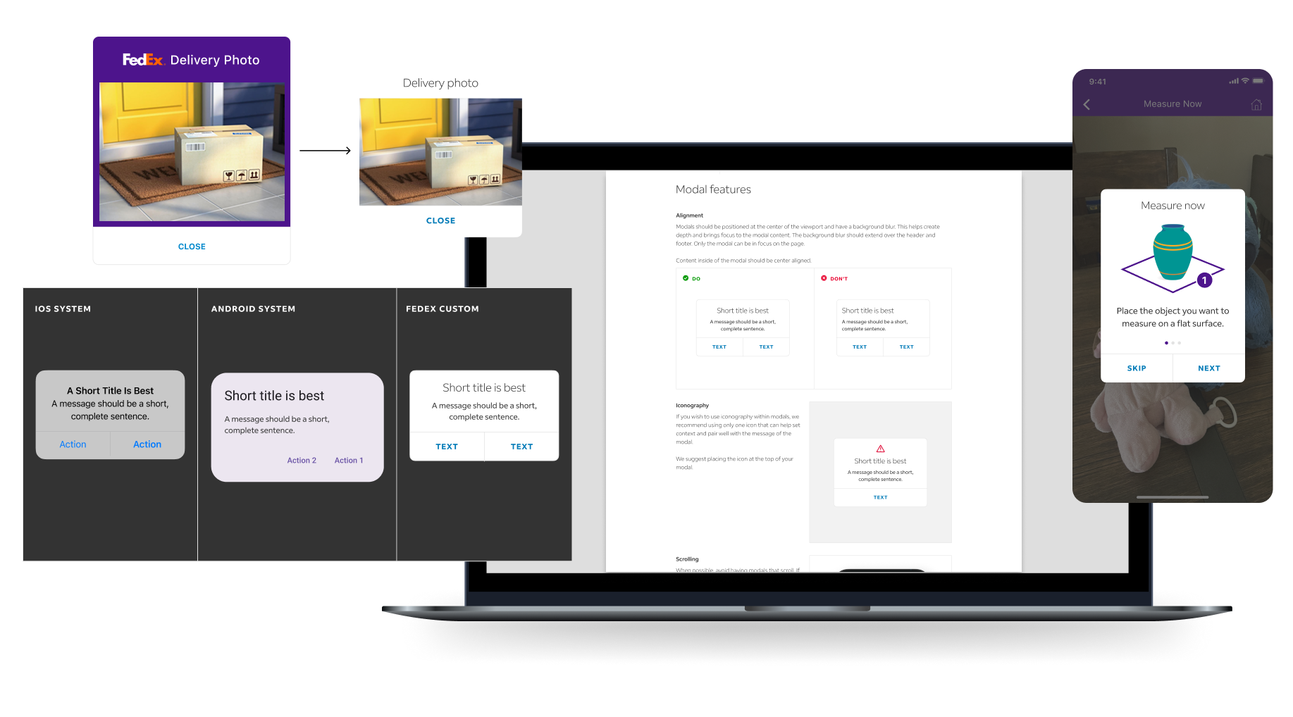
Modals & dialogs
DOCUMENTATION
Our approach was to educate designers and content authors on which communication model to use at which time in the user journey. We provided written examples and guidance on modals, dialogs, alerts, takeovers and notifications.
We decided to guide designers towards enforcing a customized modal with FedEx system standards when communicating information from the brand. All other system comms can be native.
We provided new examples of all modal types identified within the app today for the Mobile Team to use for next steps with the development team.

Imagery & illustration
OPPORTUNITIES | DOCUMENTATION
We delivered an exploratory file that detailed where imagery and illustration could be used throughout the app. The onboarding flow, empty states and promotions were the best opportunities for easy adoption.
We wrote the documentation in-line with the FedEx Design System media usage with added sections offering approved device frames for mockups.
Conclusion
After the 6 weeks, we concluded the project and I presented a walk-through of our process and final deliverables to the FedEx Mobile Team, Brand Team, and Design System Team. This included six pages of written design system documentation, one published Figma component library with ready-to-use components, and dev-ready opportunity screens for areas of improvement.
Note: FedEx was not using Figma variables and tokens at this time.